Tuesday, February 26, 2013

25 Years Together

Trying my hand and portraiture again.  I did this all in one afternoon as a gift for Jeff for Valentine's Day.  The reference photo was taken on our 25th wedding anniversary.


"25 Years Together"
11" x 12"
Watercolor, Arches, 300# Cold-Press

Tuesday, February 12, 2013

"French Horn"

I liked this photo of my nephew Spencer playing the French Horn because it tells the viewer something about him.  

When I decided to create a painting from this photo I realized that the French Horn dominates the picture.  It is a very elegant and elaborate instrument but I want the focal point to be centered around his face with a little of the instrument so I'm going to try to fade out the lower part of the horn and make it less intrusive to the final piece. That's the plan, anyway. :)  

I'm also trying to take a little more time in the planning process with the hopes of not "getting lost" during the actual painting.  Here are my steps so far.

Step 1: Enlarge, crop and lighten reference photo, remove background

Step 2: Thumbnail sketch, value scale


Step 3: Played with various color combinations and then did a quick color study


Step 4: Stage 1 of the painting.  He is playing at his 8th grade graduation.  I want to down play his graduation gown which is burgundy and his accomplishment medals because I think it would make the painting too busy so I've grayed down his costume at this point.

Sunday, February 10, 2013

"Spencer"

I just found a wonderful used book on-line entitled, Paint Watercolors Filled with Life and Energy, by Arne Westerman.  I sat down and read and read and read.  I like the style of this book because he explains what makes a good design and how he sets about accomplishing that task.  He gives plenty of examples of paintings that he feels meet a particular criteria.  

This painting is of my nephew, Spencer, on his 8th grade graduation.  I tried to use some of the design suggestions from the book, including starting with a thumbnail sketch, I did two but like this one best.  I still had a hard time going really dark though and ended having to work over the painting a bit.  This is pretty small, I think it will help me if I start painting larger. 


"SPENCER"
7x10
Watercolor, Kilimanjaro Cold-Press


Monday, February 4, 2013

Boats on Monterey Bay

I took the reference photo for this painting at Monterey Bay a few weeks ago when we were having unseasonably warm weather.  It was one of my favorite weekends, lunch with good friends and sitting watching the huge waves crash against the rocks while we explored the tide pools.  These boats drew my interest because of the way the wood was worn and the boat on the right was filled with water from the previous rains.  For this painting I wanted to push the limits on color and give them a playful look with contrasting colors and orange and yellow water.  I added the pen and ink to finish the boats and give them a little bit of a graphic style.


Sunday, February 3, 2013

Callie

This latest painting is for Russ and Cheryl, my brother/sister-in-law.  This is their youngest dog, Callie, a Golden Retriever.  I meant to photograph my painting process but only managed to get one photo before completing it.  It was so fun and went somewhat quickly that it was done before I remembered I was planning more photos.  Originally I had left the exterior of the ears and fur white with the intent to put in a dark background but I just kept painting. :)  I might try it again following my original plan.  I did run into my usual problem when trying to paint "loose", that is that I am still timid with the amount of pigment I set down.  I did have to work this piece a little more than I had wanted to because I had to darken areas.  I need to work on being bolder with my color and frugal with my brushstrokes.  All in all, I am pleased with the results.


"CALLIE"
10" x 14"
Watercolor, Kilimajaro Cold-Press


Friday, February 1, 2013

Split Palette with Warm/Cool Primaries

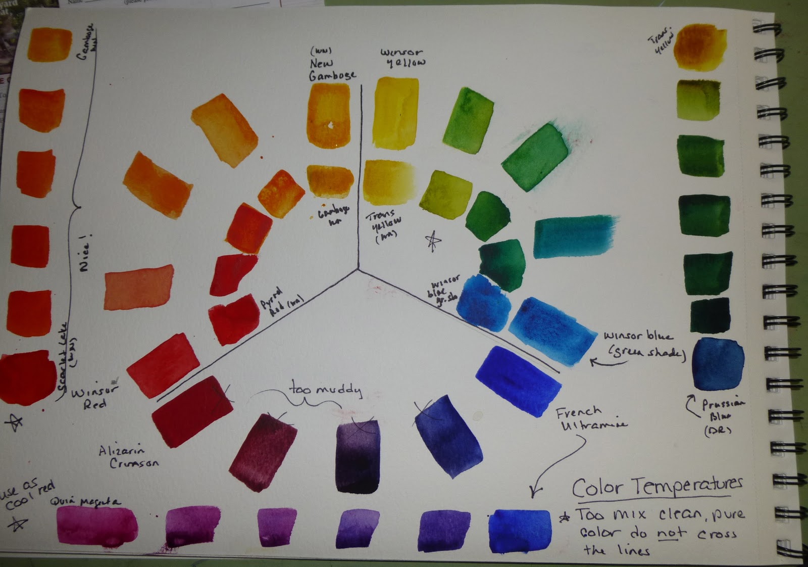
These are two slightly different palettes with 2 of each primary, one warm and one cool.  The idea is that if you want clean, clear colors do NOT cross the black line when mixing primaries (i.e. mix a warm red with a warm yellow to get a bright orange).  Alternately, for variety, shadows, darks, more neutral colors, DO cross the line when mixing two primaries (i.e. mix a cool blue with a warm red).  


This first one shows how I changed the primary colors to get cleaner brighter mixtures of orange, green and purples.  I marked the ones I prefer with an "X"


This next one is just show an example of some of the warm and cool primaries that I have in my collection.


The last one is another warm/cool split primary palette, this time using a different cool yellow and a different cool red.  Just to compare more mixes with what I did with the first page above.  In this color wheel the yellow is Cadmium Lemon which is a lovely color by I don't like the fact it is opaque (although the greens are very nice).

Color Theory

I've been playing with some of my color theory books and making different color palettes - delicate, old masters, standard, intense, earth, etc.  Here are pages from my little color journal so far.


Rooster #3

I forgot to post Rooster #3 which I did rather quickly during our weekly art group.  It's hard for me to paint and chat but I wanted this to be extra loose so it worked out.  It needs a little something else, a background or drips or something. Pattie suggested that I not draw so many lines on my watercolor paper which might force me to loosen up and stop the "color-in-the-lines" approach I keep falling back on.   I'm thinking of trying again with different color palettes just for the sake of experimentation.