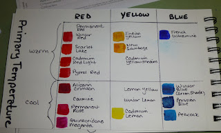
These are two slightly different palettes with 2 of each primary, one warm and one cool. The idea is that if you want clean, clear colors do NOT cross the black line when mixing primaries (i.e. mix a warm red with a warm yellow to get a bright orange). Alternately, for variety, shadows, darks, more neutral colors, DO cross the line when mixing two primaries (i.e. mix a cool blue with a warm red).
This first one shows how I changed the primary colors to get cleaner brighter mixtures of orange, green and purples. I marked the ones I prefer with an "X"
This next one is just show an example of some of the warm and cool primaries that I have in my collection.
The last one is another warm/cool split primary palette, this time using a different cool yellow and a different cool red. Just to compare more mixes with what I did with the first page above. In this color wheel the yellow is Cadmium Lemon which is a lovely color by I don't like the fact it is opaque (although the greens are very nice).


1 comment:
Thanks to your examples I finally understand why and when to cross the black lines with cool and warm primaries in my palet. I had read an article about this but your article cleared up the great time saver of this proceedure. I am moving to acrylics and the color theory still applies I think.
Richard Groleau
Post a Comment